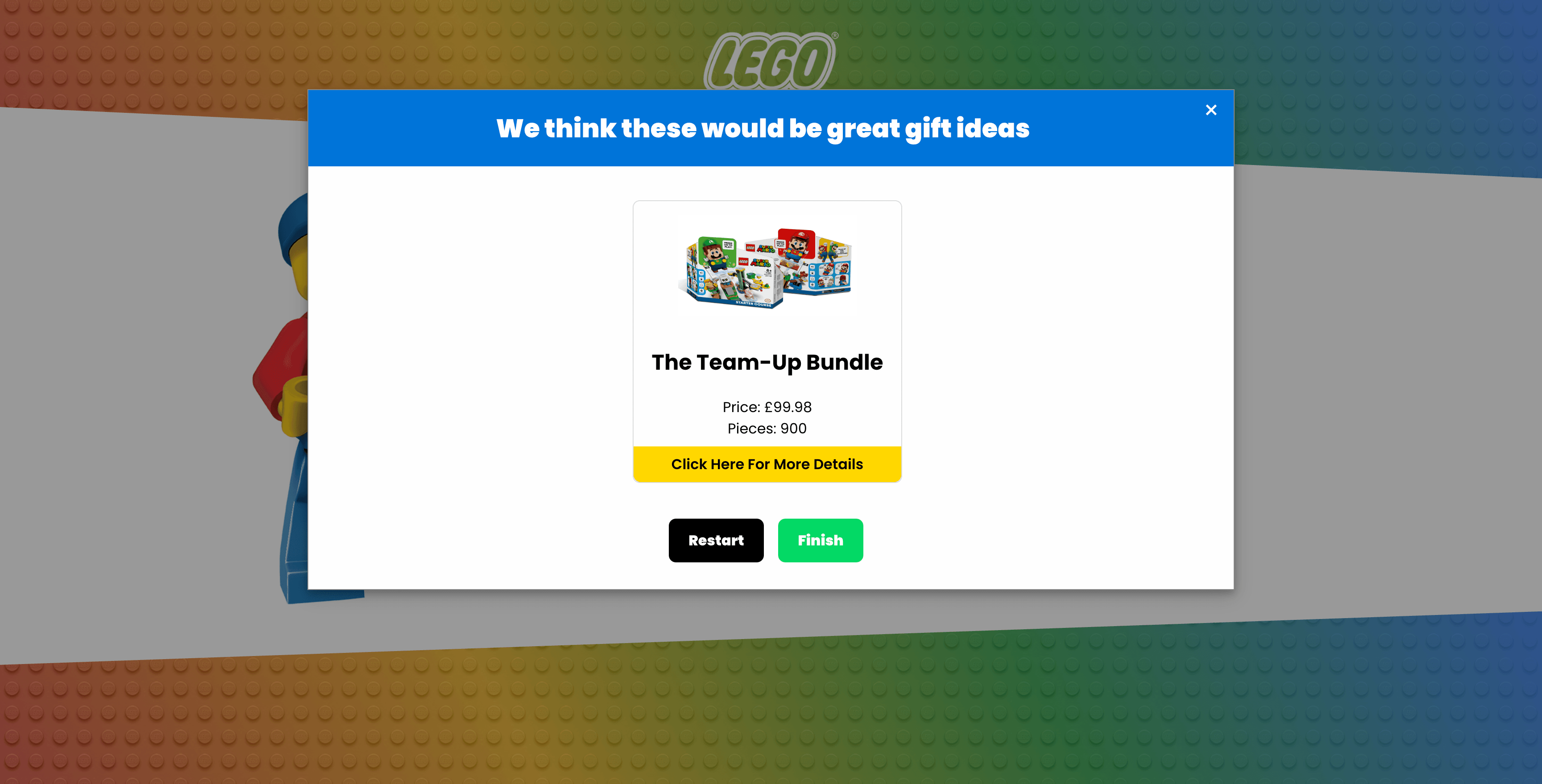
Why I Built This
A while ago I wanted to properly understand how to build vanilla JavaScript components from scratch without relying on a framework like Vue or React. I'd been doing some research into product recommendation quizzes at the same time and the two ideas came together naturally.
I love Lego. Lego do a huge range of themes including Mario, Harry Potter, Marvel and Disney and I thought building a quiz that helps someone find the perfect Lego gift would be a fun and practical way to explore the Web Components API for the first time.
The goal was to keep it simple. No backend, no framework. Just vanilla JavaScript, HTML and CSS. The data is stored in a JavaScript file as structured JSON arrays which means it could easily be connected to a backend API in future without changing the component itself. That was a deliberate decision as I wanted the architecture to be extensible even if the initial implementation was self contained.
You can find the full repo at github.com/bok04/lego_recommendations.
The Data Structure
Before building anything I needed to think about how the data would be structured. I created a data.js file containing two arrays, questions and products.
The products array contains all the Lego sets that can be recommended. Each product has a name, image, theme, price, price range, age rating, piece count and a URL to the Lego store. For example:
{
  id: 1,
  name: 'The Mighty Bowser',
  theme: 'Super Mario',
  price: 229.99,
  priceRange: '£100+',
  age: '18+',
  pieces: 2807,
  url: 'https://www.lego.com/en-gb/product/the-mighty-bowser-71411'
}
The questions array defines the four quiz questions. Each question has a title, an attributeId that maps directly to a property on the product objects and an array of possible answers. This mapping is what allows the quiz to filter products dynamically based on what the user selects. The four questions cover:
- Theme: which Lego theme do you prefer?
- Age: who are you buying for?
- Pieces: how complex a build do you want?
- Price range: what's your budget?
By keeping the data separate from the component logic, the quiz can be extended with new products or questions without touching the component code at all.
What is a Web Component?
Before getting into the code it's worth quickly explaining what a Web Component actually is. Web Components are a set of native browser APIs that let you create reusable custom HTML elements with their own encapsulated HTML, CSS and JavaScript. No framework needed and they work in all modern browsers.
There are three main parts to the Web Components API:
- Custom Elements: lets you define your own HTML tags like
<c-modal> - Shadow DOM: encapsulates the component's HTML and CSS so it doesn't leak into or get affected by the rest of the page
- HTML Templates: reusable chunks of HTML that aren't rendered until needed
This project makes use of Custom Elements and the Shadow DOM. The Shadow DOM was particularly important here because it means the quiz modal's styles are completely isolated from the rest of the page and vice versa.
The Modal Web Component
The modal is defined as a class that extends HTMLElement, which is the base class for all HTML elements. This is the foundation of any custom element.
class Modal extends HTMLElement {
  constructor() {
    super();
    this.attachShadow({ mode: 'open' });
    this.shadowRoot.innerHTML = `
      <style>
        @import "./style.css"
      </style>
      <div class="card">
        <button id="start" class="button--start" type="button">Take the Quiz</button>
      </div>
      <div class="modal">
        ...
      </div>
    `
  }
}
customElements.define('c-modal', Modal);
attachShadow({ mode: 'open' }) creates the Shadow DOM for this component. Everything rendered inside shadowRoot.innerHTML is encapsulated so the styles won't bleed out and outside styles won't bleed in. customElements.define('c-modal', Modal) registers the component so the browser knows what to do when it encounters <c-modal> in the HTML.
The constructor also initialises all the state the component needs:
this._contentIndex = 0;      // Tracks which question the user is on
this._answerIndex = null;    // Tracks the selected answer index
this._selectedAnswer = null; // Stores the currently selected answer
this._questions = [];        // Stores the quiz questions
this._answers = [];          // Stores available answers for the current question
this._products = [];         // Stores all products
this._productRecommendations = []; // Stores the filtered product results
Lifecycle Callbacks
Web Components have lifecycle callbacks that fire at specific points. This component uses two of them.
connectedCallback fires when the component is added to the DOM and this is where event listeners are attached to the buttons:
connectedCallback() {
  this.shadowRoot.querySelector("#start").addEventListener('click', this._handlers.start);
  this.shadowRoot.querySelector("#next").addEventListener('click', this._handlers.next);
  this.shadowRoot.querySelector("#previous").addEventListener('click', this._handlers.previous);
  this.shadowRoot.querySelector(".close").addEventListener('click', this._handlers.close);
  this.shadowRoot.querySelector("#finish").addEventListener('click', this._handlers.finish);
  this.shadowRoot.querySelector("#restart").addEventListener('click', this._handlers.restart);
}
disconnectedCallback fires when the component is removed from the DOM and this is where those event listeners are removed to prevent memory leaks:
disconnectedCallback() {
  this.shadowRoot.querySelector("#start").removeEventListener('click', this._handlers.start);
  // ...and so on for each listener
}
The handlers are stored as bound methods on this._handlers rather than inline arrow functions. This is important because you need a reference to the exact same function to remove an event listener. An inline arrow function creates a new function each time and can't be removed cleanly.
Passing Data Into the Component
Because the data lives outside the component in data.js, there needed to be a way to pass it in. I added a setContent method to the component that accepts a type and the content:
setContent(type, content) {
  switch(type) {
    case 'questions': {
      this._questions = content;
      break;
    }
    case 'products': {
      this._products = content;
      break;
    }
  }
}
In main.js this is called after the component has been added to the DOM:
const modalElement = document.querySelector('c-modal');
modalElement.setContent('questions', questions);
modalElement.setContent('products', products);
This keeps the component itself generic. It doesn't know or care what questions or products it receives. It just renders whatever it's given. If you wanted to connect this to a backend API in future you'd simply fetch the data and pass it through setContent in exactly the same way.
How the Filtering Works
This is the most interesting part of the component. As the user answers each question, the products are progressively filtered down based on their selections. This logic lives in _updateNextButtonFunctionality.
Each answer is stored in sessionStorage as a JSON array of objects containing the attributeId and the selected value. When the user moves to the next question the component loops through all stored answers and filters the products accordingly:
userAnswers.forEach((answer, answerIndex) => {
  switch(answer.attributeId) {
    case 'theme': {
      filteredProducts = this._products.filter(
        (element) => element[answer.attributeId] == answer.answer
      );
      break;
    }
    case 'age': {
      filteredProducts = filteredProducts.filter(
        (element) => element[answer.attributeId] == answer.answer
      );
      break;
    }
    case 'pieces': {
      const rangeValues = this._questions[answerIndex].answers.find(
        (element) => element.value === answer.answer
      );
      filteredProducts = filteredProducts.filter(
        (element) => element[answer.attributeId] >= rangeValues.lowest
      );
      break;
    }
    case 'price': {
      filteredProducts = filteredProducts.filter(
        (element) => element.priceRange == answer.answer
      );
      break;
    }
  }
});
It's worth noting that theme always filters from this._products which is the full list, while subsequent filters like age filter from filteredProducts which is the already filtered list. This cascading filter approach means each question narrows down the results further based on what came before.
The available answers for the next question are also updated dynamically. For example after selecting a theme, only the age ratings that actually exist in the filtered product set are shown. This prevents the user from selecting a combination that would return no results.
There are still scenarios where no products are returned, for example if someone selects a very high piece count with a low price range. The component handles this gracefully by showing a friendly error message and a prompt to restart the quiz.
Bringing It All Together
The main.js file brings everything together. It imports the questions and products from data.js, imports the modal component and the stylesheet, builds the page HTML and then passes the data into the component:
import { questions, products } from './data.js';
import './modal.js'
import './style.css'

document.querySelector('#app').innerHTML = `
  <header>...</header>
  <main class="row">
    <div class="col">
      <div class="lego-person-container">
        <img class="lego-person" src="./lego-person.png" alt="Lego Brick Person Waving"/>
      </div>
    </div>
    <div class="col">
      <div class="intro-container">
        <h1>Find the Perfect Lego Gift</h1>
        <p>Need help picking the perfect Lego Gift for someone?</p>
        <c-modal></c-modal>
      </div>
    </div>
  </main>
  <footer>...</footer>
`

const modalElement = document.querySelector('c-modal');
modalElement.setContent('questions', questions);
modalElement.setContent('products', products);
The <c-modal> tag in the HTML is all you need. The browser recognises it as a registered custom element and handles the rest.
What I Learned
Building this was my first time writing a Web Component from scratch and it was a really valuable experience. A few things that stood out:
The Shadow DOM is genuinely useful for component isolation but it does add some complexity, particularly around styling. Getting styles in and out of the Shadow DOM requires some thought.
Lifecycle callbacks like connectedCallback and disconnectedCallback are the equivalent of mounted and unmounted in Vue or useEffect cleanup in React. Once you understand that the pattern feels very familiar.
The biggest thing I took away is a real appreciation for what frameworks like Vue and React abstract away. Managing state manually, updating the DOM by hand and keeping event listeners clean are all things you get for free in a framework. Doing it without one gives you a much deeper understanding of what's actually happening under the hood.
If you've only ever worked with frameworks I'd genuinely recommend trying to build something small with vanilla Web Components. It really does change how you think about the tools you use every day.