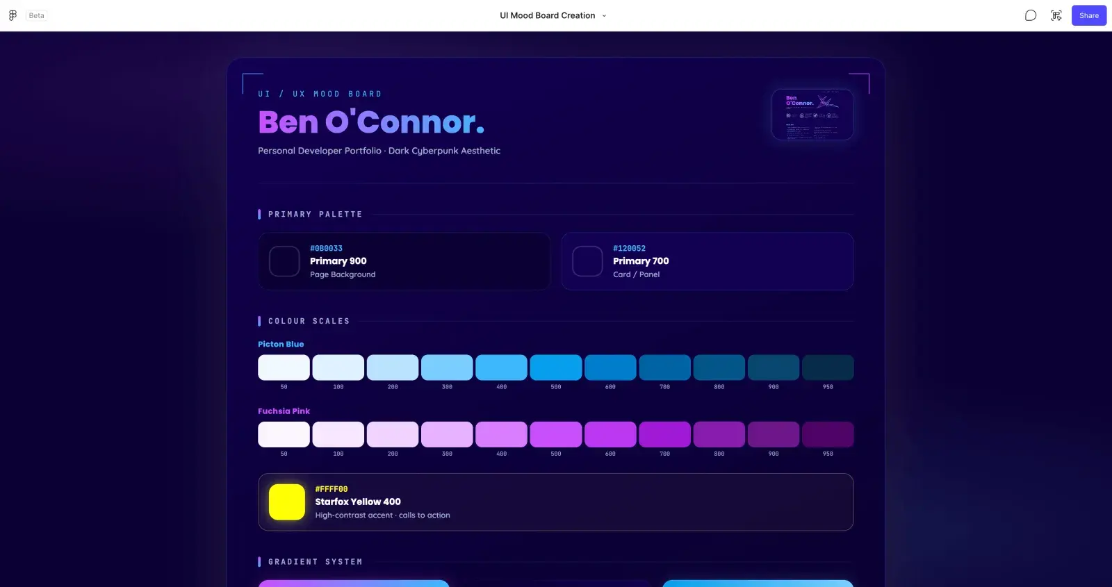
A lot of people get confused about what UI and UX actually mean. Most of the time people assume they're the same thing, but they're not. They're two completely different terms with two completely different purposes, and understanding the difference is the first step to actually building a website that works.
UI vs UX: The Actual Difference
UI stands for user interface. It's what's visually presented to the end user through a website, application, software or even a computer game. It's what's visually appealing. Colours, fonts, layout, imagery, all of it.
UX stands for user experience. It's the expected behaviour of the user, how they interact with and use the website or application. It's less about what something looks like and more about how it feels to actually use.
They're two different things but they work alongside each other constantly. You build a user interface for the design, but you also need to inspect and analyse how users actually behave and interact with that interface. Get one right without the other and the website still won't work properly.
Thinking About UX First: Know Your Audience
When you're designing a website or app, it's important that you appeal to your target audience. Who are you trying to reach, and does that fit your business needs? You need to think about the demographic most likely to be engaging with your website and whether that lines up with what you're actually trying to achieve.
This is the UX thinking that needs to happen before you touch the UI. Once you understand who you're building the website for, you can start to think properly about how you design the interface around them.
Take an e-commerce business as an example. You need to think about your product, who it's for, and how your website needs to look and feel for that specific customer.
Selling nutritional products is a good example of this in action. Customers buying nutritional goods want more description and information on the product page. Concise, easy to read, but enough information that they genuinely understand what they're buying and why. When you analyse customer behaviour on nutritional e-commerce sites, you'll see significantly more time spent on product pages, because customers are invested in understanding what they're putting into their body. They'll read the description, then look at reviews, then often go and research the product externally on Trustpilot or Google before buying. That means your product pages need to reflect that expectation, and your review presence elsewhere needs to hold up too, because customers will seek it out before they commit to a purchase.
A portfolio website works completely differently. Instead of focusing on dense information, you're focusing on engagement, leading the customer towards your services page. The information about what you do needs to be concise, pointed, easy to read and easy to understand. Clear links through to reviews still matter, but so do clear examples of previous work. All of this feeds into building the picture of who you are and what you offer, and it's the user expected behaviour that shapes how you present it.
This is why UX matters so much when designing a website or app. You're thinking about how the user is going to interact with your business before they've even visually seen it.
Then Building the UI Around It
Once you understand the user behaviour you're designing for, you can start building the UI properly. And the UI matters because it needs to sell your brand and your ideas. Colours, themes, font styles, they all count, because they present how professional you look.
If a customer lands on a website that looks dated, or a brand that hasn't been updated in years, they won't engage. That's the bounce right there. Getting the presentation right is what keeps someone on the page long enough for the UX thinking underneath it to actually do its job.
This is where UX and UI line up. You've thought about how the customer needs to behave and engage, and now you're designing the interface to support that.
Back to the e-commerce example. You want the UI to be visually appealing but also make the key information genuinely easy for the customer to find. If you've got bullet point information about a product, do you place it near the top of the page, above the fold, where engagement is highest? Do you present those key points visually, maybe with a pale background colour and an icon that draws the eye? For nutritional goods specifically, that might mean visually presenting things like milligram content, tablet count, or whether it's a UK-made product, right where the customer's attention naturally lands first.
For the portfolio example, it's a different set of UI decisions. Do you break your services down into a step by step flow presented in boxes? Do you put the contact form above the fold so it's the first thing someone sees, prioritising the action over the information? Or do you move it further down and lead with the explanation of how you work first? There's no single right answer, it depends entirely on the outcome you're trying to create.
Accessibility Is Part of the Job Now
Especially by today's standards, accessibility has to be part of this conversation. Not every user is going to look at your website visually. Some will use tools to interpret it, screen readers, VoiceOver, dictation software, magnification tools, colour contrast adjustments. It's important that we make the web as accessible as possible to everyone, and these options can drastically change how a website appears and performs for the person using it.
Accessibility isn't just a nice-to-have either. It's directly reflected in website performance tools like Lighthouse, which gives a clear indication that Google takes accessibility seriously as part of how it evaluates a site. And it's becoming a legal requirement in more places too. The EU introduced its Accessibility Act, requiring new products and services from 2025 onwards to ensure they're accessible for disabled users. Personally I think that's a great step, and it's something all of us building for the web should be taking far more seriously regardless of where our own websites are based.
Accessibility is something I feel strongly about, partly for personal reasons. If you want to understand why this matters to me specifically, along with some practical steps you can take, I've written a full post on nystagmus, colour blindness and web accessibility.
Designing for Mobile and Desktop Differently
Something worth being genuinely aware of is that we no longer view the web mostly on a large desktop screen. We actually now split our time fairly evenly between desktop and mobile. At the time of writing, over 50% of web traffic comes from mobile devices and around 47% from desktop, according to StatCounter's global stats.
That means when you're building a user interface, you need to think about how it appears on both. The most common and generally recommended approach is responsive design, where your website adapts to different device sizes through media queries in CSS. But it's not just about the interface adapting. You also need to think about the different behaviours mobile and desktop users bring with them.
Mobile users tend to be quick decision makers. They want information fast and they want it now. Desktop users tend to take their time, read things through properly, compare options and make more considered decisions.
Knowing this changes how you approach the design itself. For mobile, you want a menu that's quick to navigate, as much important content above the fold as possible, and a genuine awareness that users typically lose patience and disengage after around 10 seconds if they can't find what they're looking for. Keep it easy, quick and simple.
That said, always look at your own data first. Your website might be heavily desktop-weighted or heavily mobile-weighted depending on your audience, and that should guide your priorities rather than assuming the general split applies to you. There are some great analytics tools that can help here. One I'd recommend is Simple Analytics, a free option that doesn't require a cookie banner and anonymises the user, which is ideal if you only need minimal data like device type or browser.
Testing What You've Built
The most important thing in all of this is making sure UI and UX genuinely match up with each other. And the goal you're testing against depends entirely on what your website is actually for.
If you're running an e-commerce site, the metric that matters most is usually your conversion rate, the rate at which a visitor actually converts into a sale. If your website is more focused on leading people to engage and get in touch, you're more likely to be looking at click-through rate, how often a link, contact form or button actually gets clicked and interacted with.
Knowing which of these you're optimising for is what makes A/B testing genuinely useful rather than just guesswork. A/B testing means running an experiment with a clear aim, then comparing two versions of something against each other to see which one performs better against that goal.
A few real examples of what that looks like in practice:
- Does changing an "Add to Cart" button from blue to green lead to more engagement and a higher click-through rate?
- Does moving a contact form from below the fold to higher up the page lead to more engagement, simply because the user sees it sooner?
There's a huge amount you can experiment with across a website. Navigation menus, call to action copy, marketing imagery, button placement, even the links inside your footer. Once you've got a solid understanding of the user experience you're designing for, A/B testing lets you build different interface options and find out, with actual data, which one genuinely works for your goals. It's one of the more enjoyable parts of this process, and something worth trying once you're comfortable with how your website actually behaves.
Don't Forget to Test Across Browsers and Devices Too
Testing isn't just about A/B experiments though. Don't forget to test your website or app across the various browsers people actually use. What renders correctly in Chrome won't always look the same in Safari or Microsoft Edge. Always test on the latest browser versions, prioritising wherever the majority of your traffic actually comes from. If you're building a mobile app, test on the latest iOS and Android devices where you can. If you don't have access to every device yourself, tools like BrowserStack let you test across a huge range of browsers and devices without needing to own them all.
Real Examples of Good UI and UX in Action
Theory is one thing, but it's much easier to see what good UI and UX actually looks like in practice. Here are a few websites I think get it right, and why.
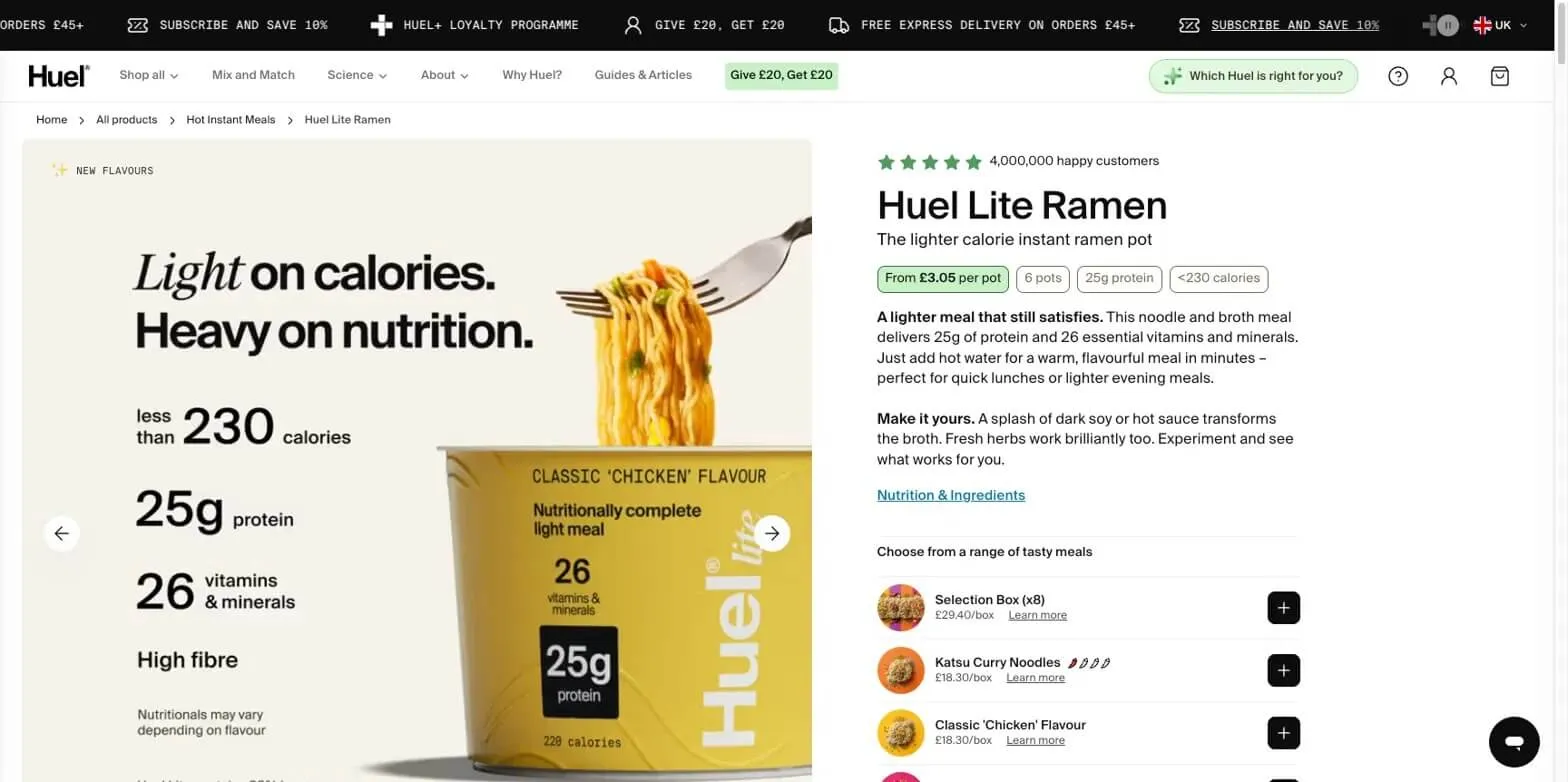
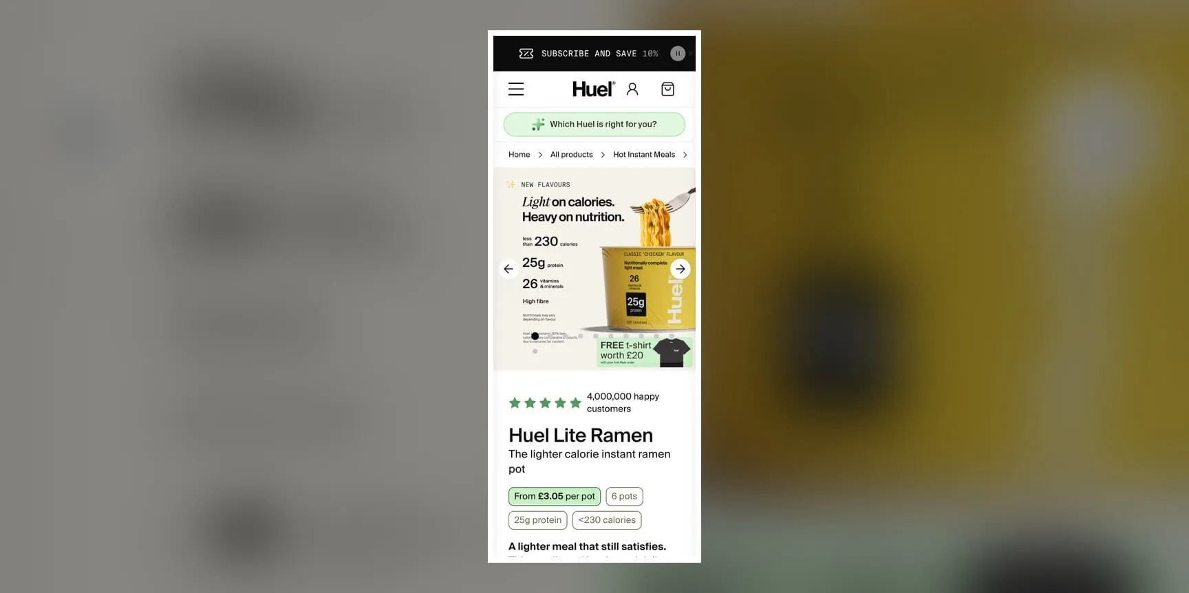
Huel works brilliantly across both desktop and mobile. They've placed the nutritional information as high above the fold as possible, and gone as far as including it directly inside the product imagery itself. That shows Huel understands its audience and understands exactly what sells the product. By presenting that information clearly and immediately, they remove the friction of having to dig through a product description to find it. Customers can still read the full description if they want more detail, but Huel have recognised that quick, scannable snippets of the key information are what actually drive a sale.
Drag the slider below to compare how Huel adapts the nutritional callouts between desktop and mobile.
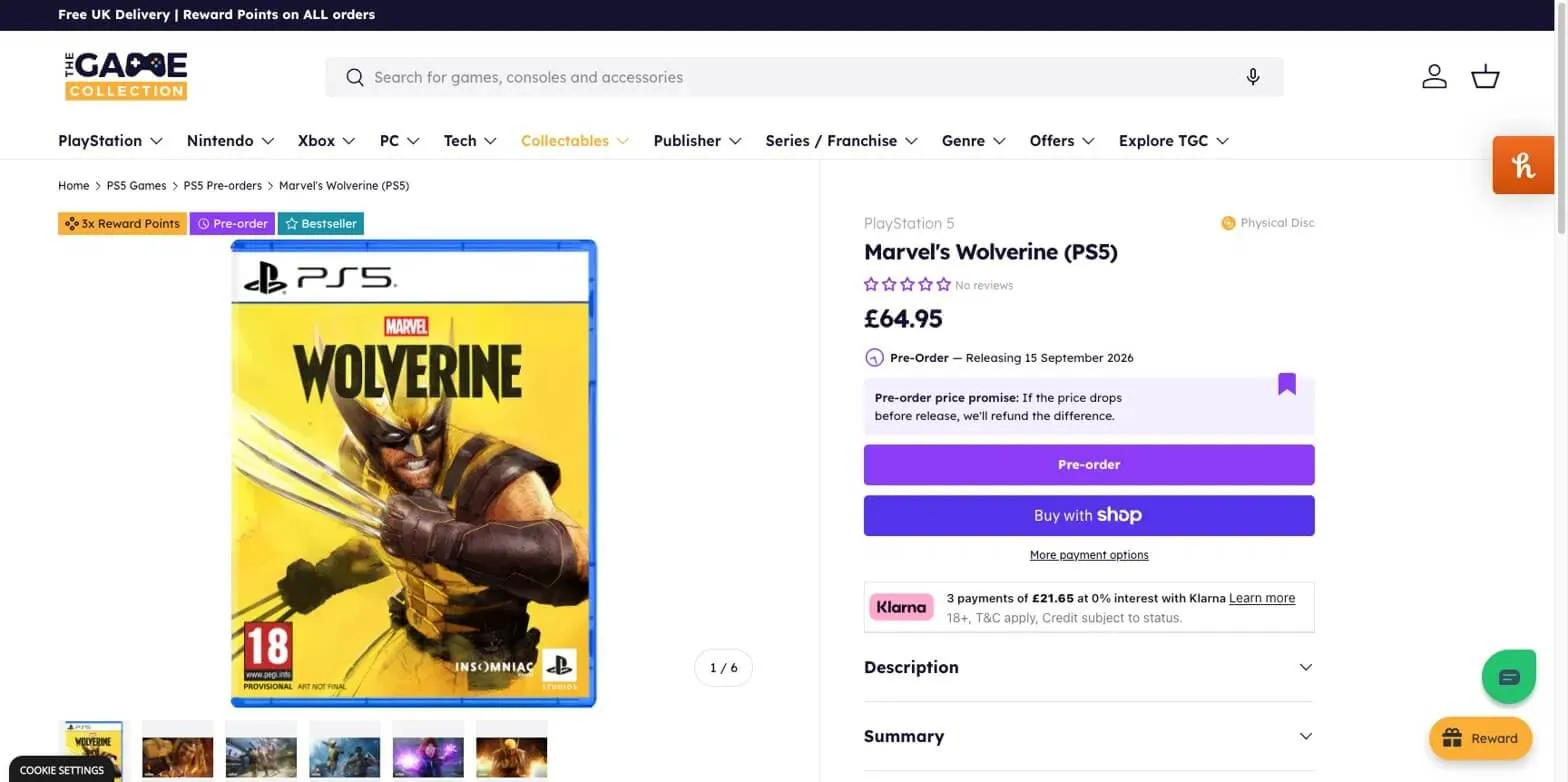
The Game Collection is another strong e-commerce example, and they focus heavily on rewards and points for pre-ordering. That information sits as quick, visible badges right above the product image, with a reminder in the corner reinforcing what those rewards actually mean. It pushes the focus towards ordering directly from them to earn rewards, which is a genuine point of difference against competitors. They've also clearly labelled whether a product is physical or digital, a small detail that removes any ambiguity for the customer before they buy.
Drag the slider below to see how those reward badges and product details are prioritised across screen sizes.

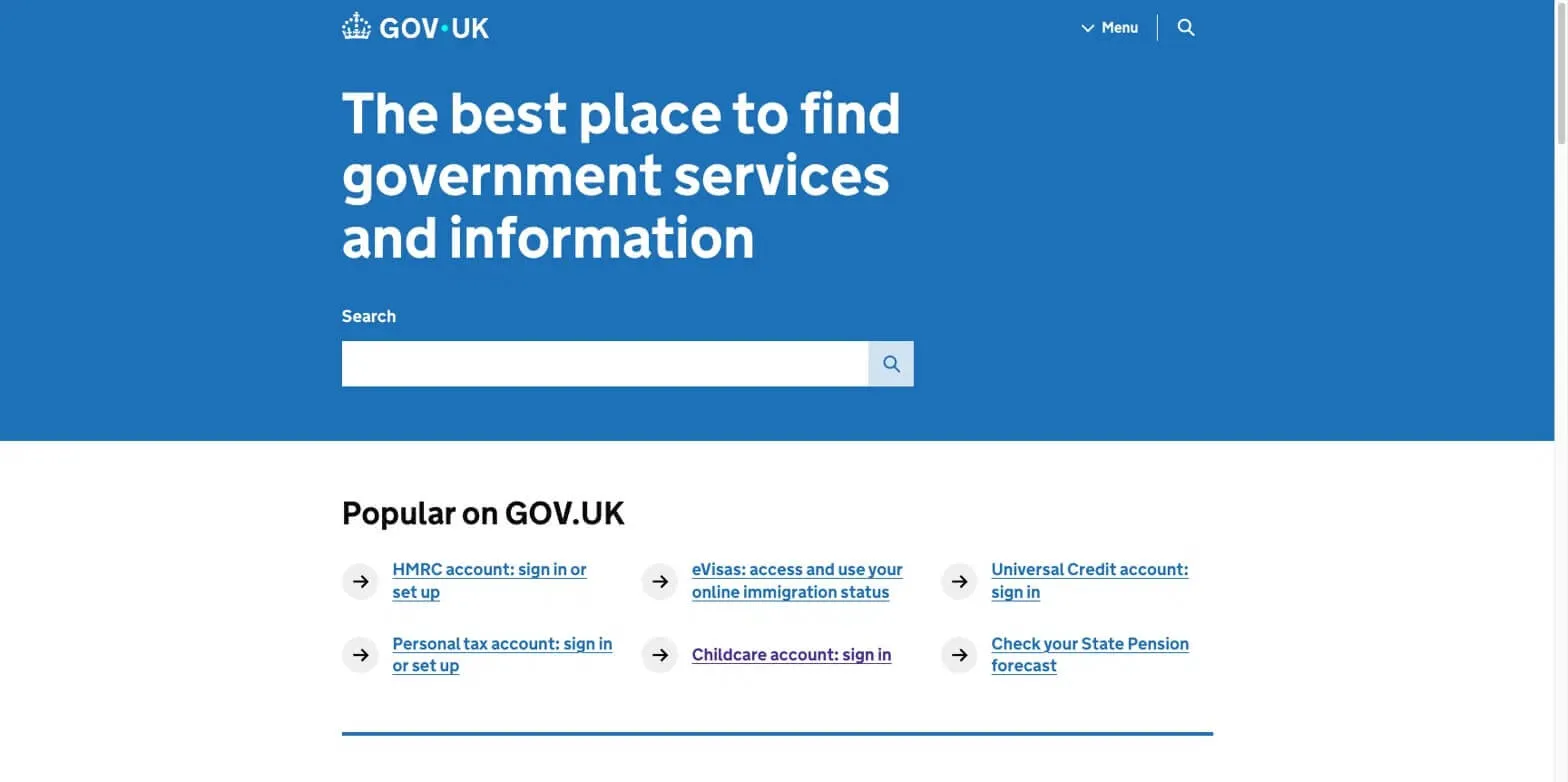
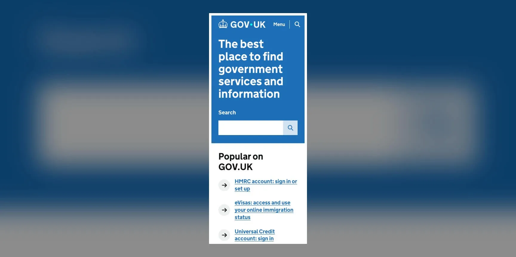
GOV.UK is a genuinely excellent example of a website that understands its audience, especially when it comes to accessibility. The contrasting colour tones, the font sizing, the clear emphasis on the search bar as the main action point, all of it guides the user straight to where they need to go. GOV.UK has to make sure the information it provides is easy to read, easy to understand and completely clear, so a huge amount of emphasis goes into making sure it's accessible to everyone and that nothing gets misread or misunderstood.
Drag the slider below to see how the search bar and hierarchy hold up between desktop and mobile.
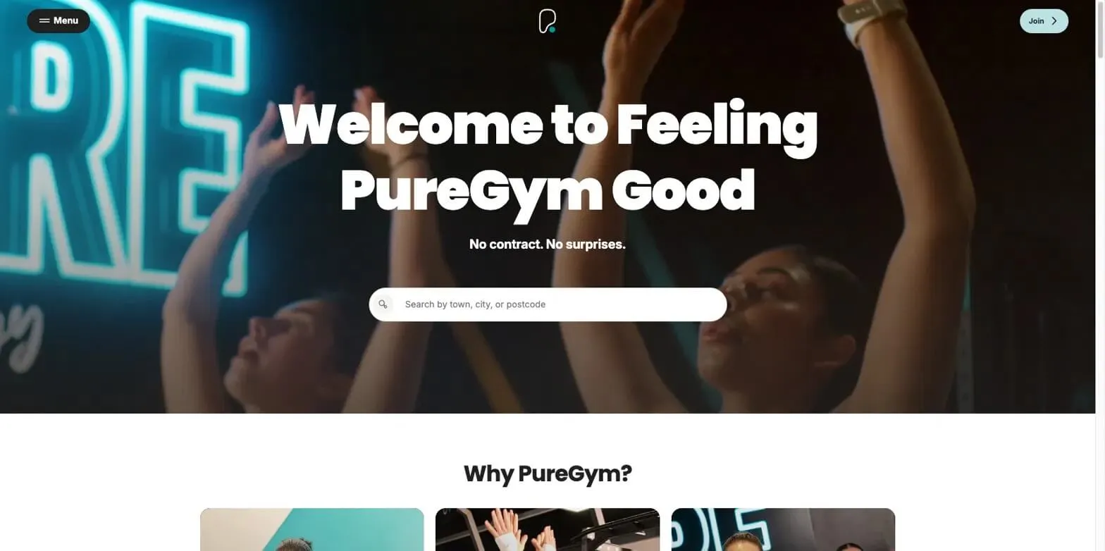
PureGym does something similar for a very different purpose. It guides the user straight to a search bar and leans hard into its brand positioning as a straightforward, no contract, no surprises, affordable gym. You're prompted to enter your location right away to find your nearest gym and see pricing. The short autoplay video helps build motivation, and on mobile the "Why PureGym?" section sits just below the fold, a small but deliberate nudge that encourages you to keep scrolling and understand what actually sets them apart from competitors.
Drag the slider below to see how the hero, search bar and "Why PureGym?" section reflow between desktop and mobile.

Common Mistakes I See
Designing for yourself instead of your audience. Building a website or app around how you personally like it, or think it should work, isn't the best approach. Your customers and users are your best guide towards conversions and sales, not your own preferences. As I've said, data is king, and understanding how that data works for your website is often the difference between success and failure. Good UX comes from understanding your customer and genuinely valuing that data, then building the experience and the UI around it. Your audience isn't one single group either. Different personas within it will respond differently, and that's worth designing for directly. New customers, for example, tend to be looking for trust signals, so it's worth emphasising what makes your business credible and trustworthy to someone who's never bought from you before. Returning customers already trust you, so they're often more interested in seeing more of what they already know they love, whatever the data tells you that is.
Killing your own page speed. Don't sacrifice performance for the sake of a flashy interface or an overly designed page. Search engines put real weight on page speed and how quickly a page actually renders. It's tempting to add high resolution marketing imagery everywhere, but it's worth asking whether it's genuinely necessary, or whether users would rather see enough to move towards a purchase or find what they need quickly. A slow site burns through a customer's attention before you've had the chance to make your case. You therefore need to make sure you're keeping your website highly optimised, taking advantage of content delivery networks, monitoring performance through tools like Lighthouse, and making sure your website or application code isn't bloated, using techniques like tree-shaking to strip out what isn't needed. Images and videos should be served through a CDN too, using modern formats like WebP rather than defaulting to older, heavier file types.
Overloading the page with calls to action and popups. Too many competing buttons or popups confuses the user and can make a website feel unprofessional, sometimes even desperate. It kills momentum and can distract a customer entirely from where you actually wanted them to go. That said, popups aren't inherently bad when used with intent. Timing matters. Does a popup appear as a user is about to leave the site, offering something enticing or a "did you forget?" style nudge to keep them engaged? Used well, these can genuinely stop someone leaving and give you valuable insight into what that customer is actually looking for. There are some excellent tools for understanding this kind of behaviour properly, including heatmaps and session replay tools that let you watch back how a real customer interacted with your site. Highlight, Microsoft Clarity and OpenReplay are all worth looking at here.
Forgetting accessibility. This needs to be considered from the start, not bolted on afterwards. With the EU Accessibility Act now in place, making sure your website is genuinely accessible and user friendly for everyone matters more than it ever has.
Never updating your design. The web moves fast, and websites and apps age quickly if left alone. If you're not keeping up with modern frameworks and technology, you'll fall behind. Google also tends to favour websites that show ongoing activity over those that sit static for years. It's worth regularly reviewing whether your design still fits your customers' needs and whether it's genuinely generating the business you need it to. Keeping a website fresh sends a signal to search engines that you're catering to modern standards, which helps build SEO rankings over time. The same logic applies to mobile apps. Regular updates help with ASO, app store optimisation, signalling to app stores that your app is current and genuinely engaged with its audience.
Relying entirely on default themes. Whether that's Shopify, WordPress, Magento or otherwise, it's quite easy to spot a website that's never moved past its out-of-the-box theme with no personal design thinking added. That said, there are some genuinely excellent examples of Shopify sites out there that go well beyond the standard template. It's on you to design a theme that actually works with your brand and business. Set yourself apart from the rest, and take advantage of building interfaces your competitors might not have even thought of.
Not testing at all. Not analysing your data through analytics tools, not running A/B tests, just guessing and hoping the design works rather than actually finding out. Testing is what helps you resolve issues on your website quickly and actually achieve your business goals, rather than leaving that to chance.