
Astro, React and Next JS. Oh My!
At the start of this year, I set three goals for myself: to rebuild my website, to start a new project, and to create a Star Fox-style game using Unity. I also challenged myself to finish 50 games this year. I have a big backlog to get through, but that’s a topic for another blog post.
So far, I have accomplished two of my goals, and I'm really happy about that. Rebuilding my personal website from Astro, which I built almost two years ago, and creating a new site for a friend are two achievements I’m proud of this year. I plan to work on the Star Fox game, and I will document my journey into game development next year, so look out for those posts.
For a while now, I have wanted to switch from Astro back to React with Next.js for my personal site. I didn't have any bad experiences with Astro; in fact, it was quite the opposite. I chose Astro at first because it was a newer framework, and its “less JavaScript by default” approach really appealed to me. I wanted to challenge myself with a framework that promoted minimal use of JavaScript.
What follows is my personal experience with Astro and what I learned while developing with it. Astro has likely changed a lot since I last used it, so some examples I mention might be outdated. This reflects my experience using Astro in late 2023 and early 2024.
Working with Astro
In many ways, Astro fundamentally changes how you think about JavaScript on the web. I was coming from a background of working heavily with Nuxt and Vue, so dropping back into a more “vanilla” JavaScript mindset felt completely alien at first. With Astro, there were no built-in helpers or reactive structures like you get with Vue or React unless you explicitly opted into them. That was part of the challenge, and also part of the appeal.
I could still organise my project in a familiar way with folders for components, pages, styling, and assets. However, one of the biggest mental shifts for me was understanding how and where JavaScript actually runs. By default, Astro components render to static HTML on the server and don’t automatically ship their JavaScript to the browser. This meant that any DOM-based interaction, animations, audio, or event listeners had to live inside explicit <script> tags or inside components that were deliberately hydrated on the client.
Coming from Nuxt and React, where component JavaScript just runs in the browser by default, this was initially frustrating. I found myself writing larger blocks of JavaScript directly inside page files to control component behaviour, unless the logic was extremely simple, like outputting the current year in the footer. While this approach makes perfect sense once you understand Astro’s “ship less JavaScript” philosophy, it did slow me down while I was still adjusting to the mental model.
Where the JavaScript Confusion Started
One of the first real points of friction I hit with Astro was working out where my JavaScript was actually running. In Vue or React, if I write code inside a component, I naturally expect it to run in the browser. With Astro, that assumption is wrong by default.
For example, in a normal Astro component, this looks like valid JavaScript:
---
const message = "Hello from Astro";
console.log(message);
---

<div>{message}</div>
But that console.log will never appear in the browser console. It runs on the server at build time, not in the client. At first, that completely threw me off.
Trying to Add Interactivity (That Didn’t Work)
My next instinct was to do something like this inside a component:
<button id="myButton">Click Me</button>

---
document.getElementById('myButton')
  ?.addEventListener('click', () => {
    alert('Clicked!');
  });
---
This looks fine if you’re used to Vue or React, but in Astro this fails silently, because document doesn’t exist on the server. No error in the browser, no click event, nothing.
That was the first moment where I realised:
Astro doesn’t ship my JavaScript to the browser unless I explicitly tell it to.
The First Working Solution: Page-Level <script>
The quickest way I got things working was by putting my logic directly into a <script> tag inside the page:
<img src="/ship.png" class="ship" />

<script>
  const ship = document.querySelector('.ship');

  ship.addEventListener('click', () => {
    ship.classList.add('spin');
  });
</script>
This worked instantly, because <script> always runs in the browser.
But now my page controlled my component, which started to feel messy as the project grew.
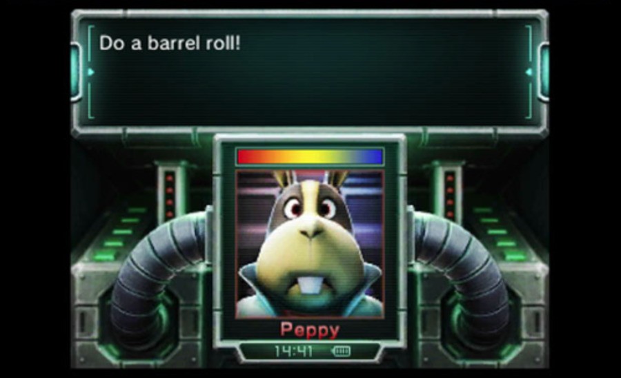
The “Correct” Astro Way: Hydrated Components
The real turning point was discovering Astro’s client:* hydration directives.
Instead of this:
<Peppy />
I needed to do this:
<Peppy client:load />
Now Astro would:
- Render the HTML on the server
- Ship the JavaScript to the browser
- Allow DOM access, audio, animations, and event listeners
Inside Peppy.astro, this suddenly worked as expected:
<div class="peppy">Incoming transmission…</div>

<script>
  const peppy = document.querySelector('.peppy');

  peppy.addEventListener('click', () => {
    peppy.classList.toggle('active');
    new Audio('/sounds/incoming.wav').play();
  });
</script>
Once that mental model clicked, Astro made a lot more sense—but it’s very different from how React and Vue work out of the box.
How This Differs From React Instantly
For comparison, here’s how the same logic looks in React:
export default function Peppy() {
  const playSound = () => {
    new Audio('/sounds/incoming.wav').play();
  };

  return (
    <div className="peppy" onClick={playSound}>
      Incoming transmission…
    </div>
  );
}
- No hydration rules.
- No server/client mental split.
- Everything just runs in the browser by default.
That simplicity is ultimately what pulled me back toward React and Next JS for my personal site.
Why animation matters
When I moved back to React and Next.js, one thing I wanted to get right from the start was making sure the site felt animated. Having worked in UX and UI for e-commerce over the years, I’ve seen first-hand how motion can shape how people experience a website and how confidently they move through it.
I spent a bit of time researching animation libraries for React and landed on Framer Motion. It’s the package I’m using across the site, and below I’ll walk through how I animated the mobile menu and the approach that worked best for me.
One of my favourite refinements on this site was the mobile menu animation. Framer Motion made it straightforward to:
- Animate the clip-path reveal of the menu panel so it feels like it slides out of the nav bar instead of just appearing.
- Stagger the menu links for a “console boot” feel that matches the Star Fox-inspired branding.
- Keep everything declarative: variants for open and closed, and a single toggle state that drives the whole experience.
The key lesson is that if you keep your motion variants small and focused, such as initial, animate, and exit, you avoid the sprawling “animation soup” that can happen when you mix imperative timelines with React state. It also keeps the code readable when you return to it weeks later.
// Example: Menu Panel Clip-Path
const panelVariants = {
  closed: { clipPath: "inset(0 0 100% 0 round 16px)", opacity: 0 },
  open: {
    clipPath: "inset(0 0 0% 0 round 16px)",
    opacity: 1,
    transition: { duration: 0.35, ease: [0.16, 1, 0.3, 1] },
  },
};

// ...
<AnimatePresence>
  {isOpen && (
    <motion.div
      className="absolute inset-x-0 top-full bg-primary-900/90 backdrop-blur-xl"
      initial="closed"
      animate="open"
      exit="closed"
      variants={panelVariants}
    >
      {/* nav items */}
    </motion.div>
  )}
</AnimatePresence>
What’s happening:
AnimatePresencelets the panel animate on unmount.closedhides the panel by clipping it to nothing;openreveals it with a smooth ease.- The rounded inset keeps the animation feeling soft instead of a hard edge.
// Example: Staggering Menu Links
const listVariants = {
  open: { transition: { staggerChildren: 0.05 } },
  closed: {},
};

const itemVariants = {
  closed: { y: 8, opacity: 0 },
  open: {
    y: 0,
    opacity: 1,
    transition: { duration: 0.25, ease: "easeOut" },
  },
};

// ...
<motion.ul
  variants={listVariants}
  initial="closed"
  animate={isOpen ? "open" : "closed"}
  className="space-y-2 p-4"
>
  {items.map((item) => (
    <motion.li key={item.href} variants={itemVariants}>
      <Link href={item.href} className="text-white">
        {item.label}
      </Link>
    </motion.li>
  ))}
</motion.ul>
What’s happening:
- The parent list controls stagger timing; children inherit
open/closed. - Each item slides up and fades in on open; reverses on close.
- Keeping item variants tiny makes the whole interaction easy to tweak later.
The Starwing Easter Egg
Sticking with animation, you’ll find that the Starwing on my home page doubles as a fully interactive Easter egg inspired by my favourite game series, Star Fox. On the surface it looks like a simple entrance animation, but there’s a lot more going on under the hood. If you try clicking or tapping the ship, or even pressing certain keys, you might just manage to pull off a classic “Barrel Roll.”
The Starwing is animated using Framer Motion and begins with a fly-in animation when it first enters the viewport. This is handled using the useInView hook so the animation only plays once when the image becomes visible. After that initial entrance, the component switches into a fully interactive state.
On desktop, the barrel roll is triggered by pressing the L or R key twice in quick succession. Internally, I track key presses using React state and only fire the animation when the second consecutive press is detected. This mirrors the original Star Fox control scheme and makes the interaction feel deliberate rather than accidental. When the roll triggers, the Starwing rotates a full 360 degrees in the chosen direction, accompanied by the appropriate sound effect to sell the illusion.
On mobile, the interaction changes slightly. Since there’s no keyboard input, the roll is triggered programmatically via a shared mobile state flag. When that flag is set, the Starwing performs a right-side barrel roll automatically and resets after the animation duration completes. This keeps the Easter egg accessible across all devices without sacrificing the original intent.
Clicking or tapping the Starwing doesn’t just trigger movement either. It also kicks off the Peppy transmission sequence. This ties the visual animation directly into the audio and UI layer, making the whole thing feel like a complete mini-event rather than just a visual gimmick.
What I really enjoyed about building this feature was how cleanly Framer Motion handled all the animation states. Instead of juggling timeouts and manual transforms, everything is driven through named variants such as rotateLeft360, rotateRight360, visible, and static. The component simply switches between these states depending on user input, and Framer Motion takes care of the rest.
It’s a small detail in the grand scheme of the site, but it perfectly represents the kind of playful, interactive touches I wanted to bake into this rebuild. They’re little nods to the games that inspired me to get into development in the first place.
What I’m focusing on in 2026
So what's next? A lot more! I have a few ideas for next year about where I want to grow. I plan to enhance my backend knowledge and improve my skills with Laravel. I hope to develop an API for an iOS application that I'll also be working on. I'm eager to dive into Swift UI. I'll also explore other e-commerce frameworks, having used Magento, Opencart, and WooCommerce in the past.
Additionally, I need to reach my ultimate goal of creating a Star Fox style game in Unity. I've wanted to do this for a long time. So please keep an eye on this space; a lot will be happening in 2026!